Here it is (or was).
Saturday, 17 April 2010
Elmwood
I visited Elmwood in Leeds (Guiseley) on Thursday for a chat about my work. All went well, I gained some useful knowledge about applying for the right kind of job, particularly artworker jobs and was informed I would hear back within 1 month of a possible job opportunity at Elmwood. After showing two of the designers (Simon and Steve) my portfolio, I gave them a promo pack and new business cards I had created earlier in the week.
Thursday, 25 February 2010
Business Cards
Here are new business card designs, I decided to create a much more clean and sophisticated card as this is how I see my practice heading towards.
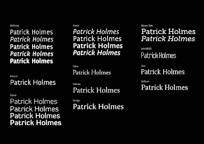
Here are typefaces which I considered:

A finishing touch to the card, I decided to break the line with a fading gradient as I felt it was too harsh and confused the break between my name and my contact details:
Here are typefaces which I considered:

A finishing touch to the card, I decided to break the line with a fading gradient as I felt it was too harsh and confused the break between my name and my contact details:
Sunday, 14 February 2010
Website
Set up an indexhibit site for my design work. I chose to avoid using my full name as the URL as 'patrickholmes.com' doesn't really slip off the tongue. Here is what I came up with instead, it is more memorable, fun, and the play on words relates to my design practice.
Holmes-Sweet-Holmes
Holmes-Sweet-Holmes
Sunday, 24 January 2010
New Branding
I have recently re-branded myself.
Here is my new logo and business card design.
I feel this logo represents a truer me, a graphic designer more focused with type and use of a clear, message driven style. I have also made progress with my web presence, i have just purchased a domain; holmes-sweet-holmes.com - this is in my opinion more memorable than what might be thought best (patrickholmes.com), and i feel this will further influence people to visit. See, at the bottom of this post, my website layout design.
Logo
Business Card (Front + Back)
Subscribe to:
Comments (Atom)


