Tuesday, 29 September 2009

CD case - Mail Shot + Business Card

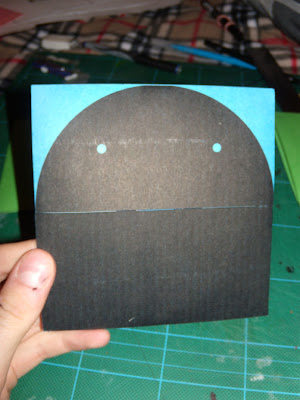
Here is my final business card, square format, monotone print onto a cyan watercolor card. I just decided to keep it simple, with a strong finish. It stands out, tells you all you need to know and the re=verse character adds a bit of fun to it and reflects my work.


After todays group crits, I have gained some useful feedback. I now plan to ditch the CD and replace it with a printed booklet of the same square dimensions, which has examples of my work printed in it. This is because a design company wouldn't feel confident inserting a random CD sent to them into a very expensive mac..which of course is understandable.

CD case - Mail Shot

Here's the final CD case. As a last minute design improvement, I have decided to only perforate the teeth, so the receiver of the mail shot can rip open the character's mouth themselves. This adds loads of interactivity to my mail shot, and everyone loves to rip open packages! I plan to re-make the case, ditch the reverse sticker and replace it with a subtle contact info printed on the reverse, and use the vinyl cutter to perfectly perforate the teeth.


CD case - Mail Shot

Teeth! - The character now has teeth, cut by hand here but when finally produced the teeth will be vinyl cut.
Also tried a yellow/black colour scheme, however i think it's over-used and may cheapen my work.

CD case - Mail Shot

Net layout for CD case; The character is printed on the left, and positioning of the sticker on the right.


Reverse: This print is to visualize a sticker, as you can see, when the sticker is removed, the split in the case is free and can be opened.


The character now has a mouth thaks to the CD cover split opening. The craft of the case closes flush against the two ends.


CD case - Mail Shot

Here are images from the first prototype for the CD case. The case splits in two, wedging the CD inside. Made entirely of paper/card..


Business Card + Mail Shot.

Here are net designs for the final CD case:


Planning to incorporate teeth onto the disc inside, so when the cover is opened, the character shows his teeth!


A sticker with contact info will hold the case together on the reverse..


Here's the final mock-up of the information side of my business card. I chose a new typeface which has some originality and bold presence to reflect my work, but avoided the somewhat overused Helvetica typeface.

Business Card + Mail Shot.

Initial Ideas, I decided to use my full name instead of a brand name, as currently my main priority is to get work placements of work from companies, and i feel using my name is more personal and therefore engages with my audience more effectively.


Concept: The arms of an octopus unfold, 8 arms!, before you finally get to the CD. Interactive, fun, and different.


concept: a CD case is transformed into a character, which opens his jaws to reveal information or a hidden CD..


Simple logo illustrations for the business cards


I am planning to print business cards onto a colour stock. This will avoid white trim and edges..and therefore make the card cleaner and much more professional. Also, printing one colour (black) onto a coloured stock is cost effective yet visually strong.