Look above this post (or the header at the top of my blog 'Patrick Holmes')
I have been playing around with simple animation in the form of web gifs, i think they add more to web-based design pieces and catch your eye, this is especially useful for a logo, like my own. The gif plays once only when the page is loaded, reload the page to see it play again.
Tuesday, 22 December 2009
Friday, 13 November 2009
Business Card - New.
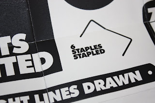
Here's a better quality version of the business card. The stock is a thin cartridge paper to aid the fold of the card, and the folds have been scored to make things cleaner.
I plan to print onto an even thinner stock to reduce size and make the card more 'wallet friendly'.
Front
Reverse
Inner fold
Fold-out Poster
Close-up of Poster
Reverse inner fold
New Business Card.
Thursday, 5 November 2009
Michael Wolff - D&AD Lecture
I travelled to Liverpool to see Olins & Wolff co-founder, Micheal Wolff, talk about his career and the design world. Interviewed by Patrick Burgoyne, Editor for Creative Review.
I took some good information from the talk, here are a few points.
Wolff's three qualities a designer should:
1) Inquisitiveness
2) Curiosity/Imagination
3) Appreciation
"Be bold but not arrogant, too many design firms come across as arrogant and it's not a good thing".
"When presenting to a client, be yourself, if you try to talk and present as a 'designer' and not a person, the clients will respond as 'clients' and not people".
"No one hires a portfolio, they hire a human being".
"When presenting, either show the client something or talk, don't do both at the same time, it's confusing".
"Designers need to be aware that they are not dismissive of language in their practice, too often designers are".
"My working partner, Wally Olins, believes structure is the largest expression of identity, however, i believe Culture is the largest expression of identity".
"Insist, don't take no for an answer, if you insist, people will see you".
"The look of something and the meaning of it need to be embraced together".
"A designer needs to investigate the nature of 'liking'".
"Lots of businesses are run by 'blobs'; where they believe money is all that matters, whereas I believe money is a result".
"Businesses are like people, some are shy, some loud, some stupid, some clever".
Don't think your 'right', your designing for someone else, someone else's message".
"There is too much emphasis on winning awards than solving client's problems".
"Sustainability is vitally important in design".
"Can the fututre of greed be afforded?"
All of these points are interesting to hear from a well experienced and successful graphic designer, I particularly admired his point on investigating 'liking', it feels quite an obvious thing to do now.
Wednesday, 4 November 2009
Dig For Fire
'Dig For Fire' are a Sheffield based advertising and design company, the largest advertising agency outside of London. I am currently talking with the Senior Designer Simon Ransley about a possible work placement.
Here is the studio in Sheffield, it holds 80 employees across a range of professions from graphic designers to copywriters.
Dig For Fire are a digital led agency, but also do some print work:
Good conceptual design is apparent, and the message is the focal point. Something of which I persue in my own work.
Dig For Fire are a digital led agency: This is an area I want to develop my skills in, I feel digital is becoming the dominating media for design with more web accessible products being produced.
Friday, 16 October 2009
Creating my website
Formatting my images to the correct size and quality. Balancing the two factors is difficult but important.
I used tables to set up the site, they are basically grids and rules used as framework in my design.
I previewed my site in a browser, and here is how the initial layout will look, with the title of my site at the top.
Here is a basic layout of my homepage, I'm keeping it simple and concentrating on navigation. This is a preview in Dreawaeaver...
However, when previewed in safari the contact box shifts to a previous version. I think this is easily fixed, just a matter of altering some HTML in the site code..
I learnt a simple yet useful tip fom the session, the small asterix in the top bar of any editing software program (illustrator, photoshop, dreamweaver..) notifys you that the file has been altered but not yet saved after that. The asterix dissapears when the document is saved.
I used tables to set up the site, they are basically grids and rules used as framework in my design.
I previewed my site in a browser, and here is how the initial layout will look, with the title of my site at the top.
Here is a basic layout of my homepage, I'm keeping it simple and concentrating on navigation. This is a preview in Dreawaeaver...
However, when previewed in safari the contact box shifts to a previous version. I think this is easily fixed, just a matter of altering some HTML in the site code..
Saturday, 10 October 2009
Business Card re-designed
Concertina-fold Booklet.
Case - remade
Thursday, 8 October 2009
Thursday, 1 October 2009
CD case - Mail Shot - Perforating.
I planned to perforate my CD case via the vinyl cutter. This didn't go quite as well as I'd hoped as after testing the cutter it wouldn't work as my stock was too small for the size of the cutting area. This is something to come back to however, I just need to source a larger size of stock. Easier said than done!


After the cutter failing, I decided to make a prototype of the case by perforating by hand. This wasn't successful as i wasn't prescise enough with my cutting, and the package just ripped when I attempted to open it.
However, this proto serves as a good indication of how the final resolution will look.


However, this proto serves as a good indication of how the final resolution will look.


Perforation in packaging.
Tuesday, 29 September 2009
CD case - Mail Shot + Business Card
Here is my final business card, square format, monotone print onto a cyan watercolor card. I just decided to keep it simple, with a strong finish. It stands out, tells you all you need to know and the re=verse character adds a bit of fun to it and reflects my work.


After todays group crits, I have gained some useful feedback. I now plan to ditch the CD and replace it with a printed booklet of the same square dimensions, which has examples of my work printed in it. This is because a design company wouldn't feel confident inserting a random CD sent to them into a very expensive mac..which of course is understandable.


Subscribe to:
Posts (Atom)


